Post #7. Readings and Critiques (Interfaces)

VoxBox: a Tangible Machine that Gathers Opinions from the Public at Events

By. Connie Golsteijn, Sarah Gallacher, Lisa Koeman, Lorna Wall, Sami Andberg, Yvonne Rogers, Licia Capra


Summary:

The conventional method of survey requires the act of directly approaching people for answers. However, in general, the public is usually reluctant to answer the questionnaires, not only because the surveys take up their precious time but also because they feel uncomfortable and burdened by surveyors approaching them for answers. Furthermore, the aforementioned action affected the pleasant experience that the people were having. All these reasons added up led to people intentionally avoiding surveyors, resulting in low response rates. Thus, in order to solve such a problem, a group of researchers came up with VoxBox – “a tangible system for gathering opinions on a range of topics in situ at an event through playful and engaging interaction.”

VoxBox was designed to be placed in public events such as festivals and fairs. Its main purpose was to collect opinions on the “feel good factor” of the events. In order to bring about high response rates and pleasant yet un-disturbing experiences for the people, the researchers decided to make VoxBox as a large tangible machine that is at first glance interactive, playful, and visually interesting. They hoped that such features would not only engage people to actively participate in the survey but also attract bystanders to contribute as well. To achieve the aforementioned goals and attributes, the designers of VoxBox considered 5 different design principles. These were:

  1. Encouraging participation
  2. Grouping similar questions
  3. Encouraging completion and showing progress
  4. Gathering answers to closed and open questions
  5. Connecting answers and results

The VoxBox was made as a modular system with separate question modules for the different groups of questions. The overall physical design of the VoxBox was implemented using three off-the-shelf shelving units. This was to ensure stability and sturdiness from many interactions and unexpected user behaviors. Each question module was designed as a drawer slotted into the shelving unit so that the questions can be moved around more easily. The incentive ball was incorporated into the system so that the people answering the survey could see their progress in an interesting and fun way. The VoxBox was controlled using open source Arduino technologies, as each question module had its own Arduino board embedded. Additionally, there was one Arduino board to control the movement of the incentive ball. The ‘Master’ Arduino had control of the overall VoxBox and had a WiFi connection that allowed survey results to be sent to the backend server and database. The data collected this way were used to form visualizations on the VoxBox itself and on its website. To make the passer-by view and discuss the data collected, simple yet fascinating visual representations were shown on the back of the design.

An initial deployment was made at a one-day conference on technology concerned with the relationship between the government, digital democracy, and the public. The researchers found VoxBox to be effective not only because people showed great interest in the machine but also because users who have used VoxBox most of the times completed the survey till the end and found the whole process very joyful. However, there were some parts to be fixed. For example, some of the users missed signals that the VoxBox presented. Also, some of the users failed to notice the incentive ball while it was showing the progress of the survey. Nevertheless, with some features fixed, VoxBox definitely showed possibility as a new surveying method for the future.


Critique:

I believe that VoxBox, if perfected, could be a very useful and effective surveying method. People avoiding the surveyors are not something uncommon. Even I avoid or ignore the surveyors that hold onto my sleeves when I walk down the street at Sinchon. Not because they take up my time, but mostly because I do not want to stand in front of them and be questioned – it is just too pressuring. If VoxBox was present at Sinchon near Uplex, I would definitely line up to try the new machine. Personally, it seems like a very effective way to gather information from busy yet tired university students who need something interesting to happen in their lives.

On the other hand, there are some aspects, if fixed, would make VoxBox much better. Firstly, I believe that it could be in another shape. Of course, it is named Vox”Box” so it is in the shape of a box. However, I believe that there are much better, more aesthetically pleasing, designs that can help attract more people to carry out the survey. Secondly, just by looking at the photos provided in the article, VoxBox seems to occupy a lot of space. Thus, it might be better if multiple smaller sized VoxBox is placed in one region so that different people can participate in the survey at the same time, rather than one user answering and others just watching. This way, the researchers can reduce the number of people not participating in the survey due to the long waiting line.


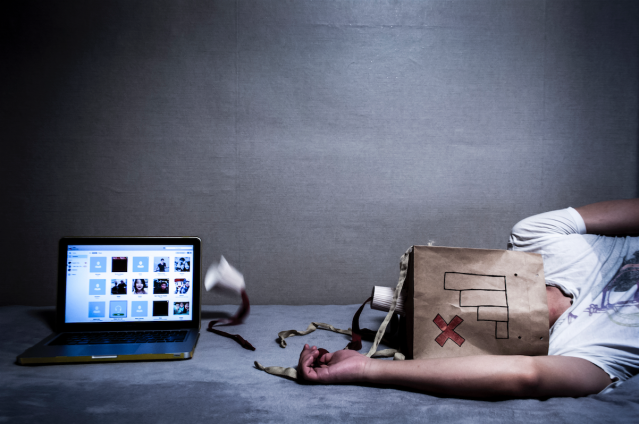
Touchless Interaction in Surgery

By. Kenton O’Hara, Gerardo Gonzalez, Abigail Sellen, Graeme Penney, Andreas Varnavas, Helena Mentis, Antonio Criminisi, Robert Corish, Mark Rouncefield, Neville Dastur, and Tom Carrel


Summary:

When surgeons plan and carry out surgical processes, it is essential for them to constantly check medical documents such as MRI to ensure the safety of their patients. The conventional method of checking these documents involved the surgeons stopping the surgery in order to check the visual images or photos of their patients. They need to interact with the display through keyboard and mouse, which not only slows down the whole surgery but also affects the sterile environment in which the surgery must take place. This could, in the long run, impact the lives of the patients.

To solve such problems, the authors of the article suggested touchless interaction within the surgery room. The most important part of the process is to give the surgeons direct control over the manipulation and navigation of images while ensuring their sterility. In order to do so, the researchers used gesture recognition aided by voice recognition technologies. They used kinetic sensors and software development kit to allow the surgeons to swipe, rotate, zoom in and out of the images. However, while developing the system, several concerns arose. One of the concerns involved the notion of expressive richness. The team had to map large sets of functionalities using a limited number of gesture vocabularies. This problem, nonetheless, was tackled through the use of one-hand-two-hand gestures, dominant and non-dominant hand movement, and voice recognition.

While developing the system, socio-technical concerns arose as well. Some of these concerns involved situating the system in the context of working practices performed by surgeons and in the setting of an operating theatre, collaboration and control problem (e.g. when multiple surgeons are in the room and the control of the system must be handed over to the other surgeon without hassle), system engagement and disengagement problem (e.g. system inadvertently recognizing some gestures as system-control gestures when they are not), the appropriate location of the surgeons when interacting with the images, and several others.


Critique:

The development of touchless interaction surgery will definitely have a positive effect in the field of medical services. Through touchless interaction, the surgeons will be able to manipulate the images more effectively and reduce the time used to move back and forth from the computer. Furthermore, a sterile environment will be ensured as the risk of bacteria infection decreases. It is interesting to see how the technology I used while playing Wii can be applied to situations that are more serious and important.

However, in order to make the system more effective, I believe that some of the problems mentioned above must be corrected. For example, in the case of system engagement and disengagement problem, the misinterpretation of a small gesture could lead to a catastrophic issue for the surgeons and the patients. What if at a state of emergency, the surgeon wanted to zoom in on the image but the device recognized it as a shutdown message and turns off? It would take time to reboot and by then the patient could have been negatively affected since they missed the precise timing. Also, in the case of collaboration and control problem, if handing over the control of the system becomes burdensome, there could reach a stage where one of the surgeons is there just to control the images. This could lead to lack of proper and wanted information and miscommunication among the surgeons.


Sources:

Golsteijn, C., et al. (2015) “VoxBox: A Tangible Machine that Gathers Opinions from the Public at Events,” Proceedings of the Ninth International Conference on Tangible, Embedded, and Embodied Interaction, pp. 201-208.

O’Hara, K., et al. (2014) “Touchless interaction in surgery,“ Communications of the ACM, Volume 57 Issue 1, pp. 70-77.

Post #6. Readings and Critiques (Emotional Interaction)

“Moon Phrases”: A Social Media Faciliated Tool for Emotional Reflection and Wellness


By. Munmun De Choudhury, Michael Gamon, Aaron Hoff, and Asta Roseway


Summary:

Emotional wellness is of great importance in the field of healthcare. Mental illness arising from unhealthy mental processes is one of the leading causes of disability around the globe, as it is the potential origin of depression, chronic fear, residual anger and others. However, emotional wellness is overlooked in many of the countries not only because most of the treatment services are considered insufficient by the World Health Organization (WHO) but also because laboratory tests for diagnosing mental illness are considered unreliable due to its heavy dependence on patient’s self-reported experiences and behaviors. Along with the aforementioned problems, vulnerable results arising from memory bias, long temporal gaps between examinations and others make the process of implementing programs related to emotional wellness very difficult (De Choudhury, 41).

To tackle these challenges, the authors of the paper suggest Moon Phrases – a tool that “tracks the emotion and linguistic expression of individuals as manifested on the social media Twitter, and presents a novel visualization” (De Choudhury, 41). Previous research proved that individual’s social environment is capable of conveying useful information related to the understanding of one’s emotional wellness (De Choudhury, 41). Furthermore, to identify the best social media cues to be visualized, the team produced low-fidelity prototypes and asked six participants for their comments. From this research, the team found out that volumes of postings on social media longitudinally and linguistic usage of various words acted as important cues for reflection (De Choudhury, 42). Additionally, the participants indicated that reflecting upon their past emotions could help them manage their feelings more effectively, cope with stress in a healthier way, and express emotions better. Thus, the design team concluded that the final product should incorporate all these factors to successfully create a service for emotional wellness (De Choudhury, 43).

The main concept of Moon Phrases was to show the daily trends of positive affect (PA) and negative affect (NA) as displayed in Twitter postings by individuals. The team collected 1000 most recent posts of each individual to analyze and archive and expanded their historical archive according to the user. Each day was visualized as a “moon”, and “the illuminated portion of the moon represented the degree of average of positivity over all postings in the same day” (De Choudhury, 43). Thus, a full moon represented greatest positive affect for the day and vise versa. Not only did Moon Phrases show the level of positivity for the day but also allowed users to check the specifics, such as date, the day of the week, each posting made, the degree of positivity and others, by simply clicking on any of the moons present. Additionally, it showed the linguistic style usage over all postings through a bar chart (De Choudhury, 43).

Moon Phrases can be viewed as an early prototype in “smart health intervention systems, derived from people’s naturalistic social activity online, for emotional wellness” (De Choudhury, 43). Even though it will be useful for people who are unaware of their mental status, there are several problems that are currently limiting the system, e.g. privacy issues. Thus, further development is necessary, and in the near future, the team is aiming to evaluate how Moon Phrases can positively impact the behaviors of people (De Choudhury, 44).


Critique:

As the paper mentioned, it is true that the mental healthcare sector is overlooked, and in that sense, the idea of using social media as a medium to diagnose and analyze emotional instability of a person is both clever and effective. Nowadays, social media is used by a wide range of age groups, thus, it is no longer only limited to the younger generations like it was a few years ago. Moreover, considering the cost and time it takes for a person to visit therapy sessions on a weekly or monthly basis, once the idea has been further developed to bring about positive impact in a person’s life, the service will probably be much more efficient than the conventional services currently available.

However, there are also several problems with the Moon Phrases model, and the issue of privacy is most likely the biggest complication that the designers will face. Since the service uses social media posts by users, it must have access to users’ previous posts and personal information, which many of the people will be reluctant to provide. Furthermore, it is hard to tell whether the contents of the posts that people update are truthful to their emotions. Social media is a place where most people usually upload memories they want to either cherish or boast about. Although some people might be truly honest with what they write on their posts, there are also possibilities where people might hide their emotions and pretend to be happy in order to fit in with others. Thus, figuring out a mechanism to distinguish between genuine and non-genuine posts will be needed – supposedly impossible.

One of the lacking aspects of Moon Phrases is that its hard to interpret the data given. Visually, it is aesthetically pleasing and the use of the moon as a symbol of positive affect is more than enough to arouse interest among the users. Unfortunately, without any detailed explanations, newcomers might have troubles trying to interpret the data given. There are also other inquiries such as whether Twitter is truly the best social media platform for this service, as it limits the number of words for each post, and if this service is truly targeting a wide audience since there are people who do not use Twitter or just social media in general.


The Haptic Creature Project: Social Human-Robot Interaction through Affective Touch


By. Steve Yohanan and Karon E. MacLean


Summary:

The overall goal of the Haptic Creature project is to identify and analyze the use of affective touch in the social interaction between human and robot. The project is also interested in how affective touch can impact the companionship between the two. The project takes the approach of creating a prototype of a robotic creature that mimics actions of small animals while they rest on a person’s lap. The robot will interact with the users only through tactile signals (Yohanan, 1).

For a long time, the sense of touch was of less importance among robotic developers when they considered different methods of social interaction between humans and robots. Affect display, which is the external manifestation of internal emotional state, has mostly been limited to vision and audition (Yohanan, 1). However, touch requires direct physical contact with the object and has been the main non-verbal communication practice between humans and animals. Thus, touch definitely has the potential of being further implemented in the field of robotics and social interaction. Affective touch, which is the touch that communicates or evokes emotion, is what the researchers of the Haptic Creature project are hoping to convey in their product (Yohanan, 2).

There were several types of research already done in the field of robot-human interaction before the Haptic Creature project, such as Paro, the Huggable, and others. The primary difference between these and the Haptic Creature is that the latter focuses mostly on the modality of touch for affect display. The secondary difference would be the level of zoomorphism, as the Haptic Creature will not have a definite, animal-like shape but will be designed to have a more amorphous appearance compared to the other research prototypes made (Yohanan, 2).

When developing the Haptic Creature, there were three major design considerations: firstly, the interaction centers are around the modality of touch; secondly, provision of organic interaction where the sensing and affect display seem as a coordinate whole; and lastly, lower level of zoomorphism (Yohanan, 2).

The Haptic Creature, although still in development process, will go through three stages in total: a Wizard of Oz prototype, an automated prototype, and a final device. The final creature will be constructed after several iterations of the automated prototype, as it will have a more robust hardware. The Haptic Creature architecture has five major components: low-level sensing, gesture recognizer, emoter, physical renderer, and low-level actuation. A combination of the prototyping stage and architecture development stage will eventually lead to a better model of the final Haptic Creature (Yohanan, 3).

The user studies focused on investigating the use of affective touch in socially interactive robotics. The studies went through processes such as asking the participants to identify each emotional response from the creature, stating their own changes in emotion, and others. The general, overall, outcome was that emotion can be communicated through primarily haptic means and that the communication actually affects the users using the product. Further research will be conducted in the future, where after the Haptic Creature has been completed, participants will be asked to adopt a Haptic Creature and use it constantly in order to check how they interact with a robot through touch (Yohanan, 4).


Critique:

The product has a lot of potentials since it is still in its development stage. Just by looking at what the team currently has, the Haptic Creature could be a big hit among a wide range of age groups. The elderly people might want to purchase this product because they cannot afford to have a living creature in their homes but want the companionship of some sort. Also, for toddlers and children below the age of 10, the product could be a safe and intuitive way for them to interact with an object while developing their tactile senses. It will also be good for people who are suffering from depression and people who want pets but are allergic to them.

However, there are also several concerns with the Haptic Creature. One of the troubles that the product might face comes from its amorphous shape. Even though the design team intended on making the shape look less animal-like, I feel like this factor might make the users lose interest in the product in a short period of time. Also, not a lot of people will buy a product that resembles their pillow. Thus, it would be better if the Haptic Creature had at least a nose or paws so that even though it still looks somewhat amorphous, it is less boring. Furthermore, it would be better if the Haptic Creature can change its temperature according to the mood of the user. If the user feels depressed, the Haptic Creature can become warmer to create a warm atmosphere as if the person is being hugged by another person. If the user is mad, then the Haptic Creature can turn colder to calm the person down. Such changes in temperature could possibly enhance the affective touch experience.


Reference:

De Choudhury, M., Gamon, M., Hoff, A., & Roseway, A. (2013, May). “Moon Phrases”: A social media faciliated tool for emotional reflection and wellness. In Pervasive Computing Technologies for Healthcare (PervasiveHealth), 2013 7th International Conference on (pp. 41-44). IEEE.


Yohanan, S., & MacLean, K. E. (2008, April). The Haptic Creature Project: Social Human-Robot Interaction through Affective Touch. In AISB 2008 Convention Communication, Interaction and Social Intelligence (pp. 1-5).


Post #5. Readings and Critiques (Social Interaction)

Presence and Discernability in Conventional and Non-Photorealistic Immersive Augmented Reality


By. William Steptoe, Simon Julier, Anthony Steed


Summary:

Augmented reality (AR) system incorporates the real environment and the virtual content in real-time. One of its goals is to integrate virtual and real imagery so that they are visually indistinguishable to the users. One of the common approaches in doing so is by enhancing graphical photorealism and illumination to make the virtual objects look like real-world objects. In order to do so, researchers must measure different material properties in order to create virtual objects that appear spatially consistent within the real world. However, this approach is very time consuming and sudden changes in lighting or scene can easily disturb the user experience (Steptoe, 213).


Thus, an alternative method, which is easier than the previously aforementioned practice, is to change real-world environment and objects so that they look more like computer-generated graphics – non-photorealistic rendering (NPR). Such technology applies image filters and non-realistic effects to the whole frame so that both real and virtual contents are affected and transformed to look similar to each other. NPR is said to make the task of distinguishing between real and virtual objects harder. However, once again, the technology has only been investigated in idealized environments in non-immersive AR (Steptoe, 213).


The experiment aims to explore discernability and presence for three rendering modes in immersive head-mounted video see-through AR. The three rendering modes are conventional, stylized, and virtualized. However, before discussing deeper into the three rendering modes, it is crucial to recognize what discernability and presence are. Discernability is the ability of users to distinguish between real and virtual objects. Presence is the psychological response of the user to patterns of sensory stimuli, allowing the users to feel as if they are actually in the virtual environment. For head-mounted immersive AR, discernability and presence are the critical factors that assess how real the experience is (Steptoe 213). Moving on to the three rendering modes, the definitions are as followed:


  1. Conventional mode:

“The conventional mode does not post-process the image, showing unaltered video feeds and uses standard real-time graphics algorithms” (Steptoe 213).

  1. Stylized mode:

“The stylized mode applies an edge-detection filter to silhouette edges of objects within the full image frame including both video and graphics” (Steptoe 213).

  1. Virtualized mode:

“The virtualized mode presents an extreme stylization by both silhouetting edges and removing color information” (Steptoe 213).


The whole experimentation was carried out in a non-idealized environment, with low-cost AR kits. Such use of low-cost components enabled “wider reimplementation and experimental replicability” (Steptoe, 214). Also, the use of cheaper materials meant that the investigation could show the impacts of rendering modes in an imperfect setup which is common in normal AR systems. The three rendering modes “represent positions on a scale of photorealism” (Steptoe, 215).


A total of thirty participants joined the experiment, all of them from the UCL’s student or staff population. These people had no previous immersive HMD experience. The three rendering modes were used as the independent variable, with 10 participants associated in each rendering mode. They were not told that the rendering modes were acting as a manipulation (Steptoe, 216). Three experiments were carried out:

  1. Participants were asked to judge whether each of the ten objects in front them were real or virtual. The objects consisted of everyday, common to home and office environments, such as Coke can, a bottle of shampoo, and computer keyboard. Out of the ten, five were real and five were computer-graphics. After initial checkups and acclimatization to the experience, the people were blindfolded and were placed with noise-canceling headphones so that they could not observe what was being placed. After the objects were placed, the AR-Rift was turned back on and the headphones were removed. Then the participants were asked to judge whether the object is real or virtual. This experiment aimed to measure discernability among the target group (Steptoe, 216).
  2. The second experiment asked the participants to walk from their current position and sit on a chair located about 2m away from them. The path in between the participant and the chair had cardboard boxes scattered around. All of the objects here were virtual. The aim was to track each participant’s foot position as they walked across the room. This helped assess the “user’s sense of presence by measuring their behavior relating to the extent to which the mixed reality environment is acted upon as the salient physical reality” (Steptoe, 215).
  3. Participants were asked to complete a questionnaire related to the experience in terms of visual quality, presence and embodiment, and system usability (Steptoe, 216).


The results were:

  1. For Discernability

The result showed that the overall mean accuracy for conventional rendering is 73%, stylized is 56%, and virtualized is 38%. From these results, one can conclude that the stylized mode was the most successful since the 56% mean accuracy indicates that participants were unable to tell the difference between physical and virtual objects. Conventional rendering showed the highest percentage, meaning that significant visual differences existed between objects. On the other hand, even though the virtualized mode had the lowest mean accuracy of 38%, the mean was so low that it actually indicated that the visual conditions of virtualized condition were either inadequate or misleading for people. Thus, the stylized mode suggested that NPR can be effectively used in unifying the appearance of an environment in immersive AR despite the range of perceptual sensorimotor cues afforded by the system (Steptoe, 217).


  1. For Presence

Participants generally walked around the virtual boxes to reach the virtual chair. However, there was each one participant from conventional and stylized mode that walked directly through the boxes. On the other hand, all participants from virtualized mode walked around the boxes. After combining the results with the responses from the survey, one could recognize that participants in the conventional mode generally believed the objects to be virtual, while those in virtualized mode believed the objects to be real. Still, the motion detector sensed similar paths for participants when walking. Behavior is similar in all modes, which indicates a high degree of embodiment and presence in the AR environment despite the differently perceived virtuality. The findings support the definition of presence in immersive AR as the “perceptual state of non-mediation arising from technologically facilitated immersion and observed environmental consistency, and which in turn gives rise to behavioral realism” (Steptoe, 218). Also, another characteristic detected was that movements were most careful in virtualized mode, where participants showed slower speed and increased number of smaller steps. This characteristic was affected by photorealism, and the tendency for careful movements in virtualized mode was probably due to the reduced visual realism of the actual physical environment (Steptoe, 218).


Conclusion:

The stylized mode is rather effective in low-cost immersive AR systems.


Critique:

As a person who did not know much about AR, I was fascinated by the fact that there are actually different modes to virtualize objects – conventional, stylized, and virtualized. Also, before reading this research paper, I believed that in order for AR to take a step further and become more “real” is for the virtual objects to look more “real” than they currently are. However, the result showed that actually, non-photorealistic rendering can be more effective than photorealistic rendering and that it might be harder for people to distinguish the differences between real and virtual objects if real objects changed to look more virtualized. Furthermore, since the researchers carried out the experiment using low-cost AR kits, it implied that the research findings can be applied to normal AR conditions that people are exposed to in their daily lives. Thus, it made the findings more meaningful and effective.


However, I felt like some parts of the research paper were rather lacking. For example, the questions asking whether the participants felt as if the mode was more virtual or real is very subjective. The answer could vary depending on each individual; thus, I felt like the survey was inappropriate to support the findings. Also, the fact that they only tested 30 participants from a certain community (UCL) made the experiment limited as well. It would have been better if they could get people from different backgrounds just to make the participant pool larger. Furthermore, having low mean accuracy does not necessarily indicate that the virtualized condition is misleading. One of the main points of this experiment was to find out which mode can trick the users so that it is more difficult for them to distinguish between real and virtualized objects. It could mean that the virtualized mode, which had the lowest mean accuracy, is actually the best method out of the three – although this is highly unlikely.


The Reactable: Tangible and Tabletop Music Performance


By. Sergi Jorda


Summary:

The Reactable is one of the few new digital instruments that passed the development stage (Jorda, 2990). Being built upon a tabletop interface, the Reactable is controlled by utilizing the tangible acrylic pucks on its surface. These pucks act as musical elements such as synthesizers and sample loops, where if a person rotates and connects the pucks on the Reactable’s round surface, he or she can create a unique composition of his or her own. The pucks illuminate and operate as soon they are placed on the surface. They interact with other pucks according to their positions and proximity. The interactions are clearly visible on the table surface, making music into something visible and tangible (Jorda, 2991).


There were several attempts to create music controllers before the creation of the Reactable. However, most of these controllers did not pursue the ‘multithreaded and shared control’ approach. Instead, they focused more on the traditional instrument paradigm, where many of them were designed so that the users must ‘wear’ and play the instrument. After the development of the Reactable, such paradigm shifted. Now, the user can perform control strategies instead of performing data, and the instrument leans towards more intricate responses to user stimuli (Jorda, 2990).


The main interface used in Reactable is the Tangible User Interface (TUI). This interface combines control and representation within a physical artifact. Digital information, such as musical elements, become graspable through the use of simple objects, like pucks, that are present on the table surface. Here, the table surface acts as a screen for visual feedback. The table feature with the TUI allows multi-user collaboration as well, where people can work together to produce a piece of music. Also, the visual feedback brought by TUI can solve several problems related to laptop music, such as perception difficulties and lack of understanding by the audience (Jorda, 2991).


The hardware used in the Reactable consists of a round interactive surface, where the visual feedback is displayed, and a tracking system based on computer vision that can track tagged objects and finger touches. The core sensor component used is reacTIVision, which is a computer vision tracking software used for fast-tracking of markers attached to physical objects, as well as multi-touch finger tracking (Jorda, 2992).


The Reactable is already a big hit around the world. More than four million people watched the demonstration Youtube video, and the product is currently used in several digital music concerts (Jorda, 2993). It is definitely a product that one must look out for in the near future.


This is a YouTube video of how Reactable is used:

(From YouTube Reactable Systems)


Critique:

The Reactable is definitely a product that will attract a lot of costumers in the future. It is unique, eye-catching, and has a different vibe to that of previous music controllers. I especially like how the table surface helps to visualize which components are being used, and the fact that musical elements can be grabbed and placed according to the composition is fascinating. Just by watching the videos provided by the inventors, I am already eager to try out the product.


However, I also found some alarming aspects that could affect the product in the future. To begin with, I felt like the Reactable has a high barrier to entry. Since the musical factors depend on the position and proximity of neighboring pucks, it seems very important to know when and where to accurately place the pucks in order to create the sound the user wants. This seems very challenging. Also, just from watching the video, neither the pucks nor the symbols are distinguishable. For a novice in the music world, this could make people frustrated about the product, and at worst, even lose interest. Furthermore, even though I love the idea of table interface and how the table helps to visualize musical elements, I felt that there exists a great limitation as to how much a person can move. Although music is not my expertise, I feel like music is not just about listening but also feeling and moving according to the music. However, this product seems to limit these movements because firstly, one must be very careful where to place the pucks and be always alert in order to not make a mistake, and secondly, the users are limited to hand movements when composing the music. In traditional ‘worn’ musical instruments, it was easier for the person to feel the music and show such feeling through body movement. On the other hand, for the Reactable, the person must always be standing within the 90cm diameter space to control the music. Although it is visually appealing for the audience, I felt like for the user, such factor could act as a disappointment.


Reference:

Steptoe, W. et. al. (2014) “Presence and discernability in conventional and non-photorealistic immersive augmented reality”  In Proc. IEEE International Symposium on Mixed and Augmented Reality (ISMAR), pp. 213-218.


Jordà, S., (2010) “The Reactable: Tangible and Tabletop Music Performance” In Proc. Human Factors in Computing Systems (CHI ‘10). ACM, pp. 2989-2994.


Post #4. Readings and Critiques (Affordance)

Affordance, Conventions, and Design

By. Donald A. Norman


Summary:

People face new objects almost every day. Every object has its own unique style and function, thus may arouse confusion when first encountered. Then, how do people know what to do when they first get into contact with new products? Donald A. Norman, the author of The Psychology of Everyday Things (in short, POET) stated that people obtain necessary information from previous encounters with similar objects and that “the appearance of the device could provide the critical clues required for its proper operation” (Norman, 39).


Donald A. Norman insists that designers must know the three main aspects that help people to understand how to utilize new objects. These are:


  1. Conceptual Model

A conceptual model is basically a combination of concepts forming a system that can help people to understand what the object is and how it functions. Although it is one of the hardest parts of a design, every successful design has an underlying conceptual model. Once a solid conceptual model has been formed, everything else must be consistent with the model. This way, it helps to enhance users’ understanding of objects within the similar genre.


  1. Affordance

The word “affordance” was first used by the psychologist J. J. Gibson as “actionable properties between the world and an actor” (Norman, 39). Simply put, it is the range of actions an object can provide usually through the way it looks.


There are two types of affordance: real and perceived. Real affordance is what the object can do in order to interact with the user. These are present even if the user does not recognize or consider their presence. On the other hand, perceived affordance is what the person believes to be the correct way to operate the object. Basically, perceived affordance is affordance with human interpretation added, thus it may not be present (since real and perceived can be different).


Affordance is deeply rooted in the design society. It is a crucial factor to consider when creating objects. Designers show more interest in what users believe to be true rather than what is actually true since their goal is to make it easier for people to interact with objects. Affordance can have different effects for varying design fields. For example, in the case of product design, since designers are creating both the shape and the function of the design, real and perceived affordance exists. However, in screen-based designs, designers can only control the perceived affordance since the real affordance has already been set – a computer or any other electronic devices.


Unfortunately, the word affordance is being misused by people. For example, after putting an icon or cursor on the screen, people may say that they have added “affordance”. However, as mentioned in the reading, “affordance exists independently of what is visible on the screen” and that these displays are actually feedbacks – perceived affordance. It is important to acknowledge the difference since affordance, feedback, and perceived affordance are independent design concepts (Norman, 40).


  1. Constraints and Conventions

Constraints are what limits the users’ actions in order to guide how they use the object. Donald A. Norman states that there are three behavioral constraints present: physical, logical, and cultural.


Physical constraints are actual physical limitations of objects and their usage. These are in close relation to real affordances. For example, moving the cursor out of the screen is impossible due to physical limitations, thus this is a physical constraint (Norman, 40). Like this, if the object cannot carry out the process that the user wants due to physical restrictions, it is called a physical constraint.


Logical constraints are logical deductions made by users to figure out an alternative solution when stuck. For example, if users are required to click on 7 locations and only 4 are present on the screen, then through logical deduction, the person will know that there are some locations off-screen. Thus, they will try to scroll down to check the rest of the page for the remainder. Like this, logical constraints can act as indirect guidance for users (Norman, 40).


Cultural constraints are defined as conventions shared by a cultural group, while the convention is a form of constraint that limits some activities but encourages others. An example of a cultural constraint would be the scroll bar on the right-hand side of a website. Most people know that they should use the scroll bar in order to move up and down the page. It is a cultural and learned convention. Whether to follow this rule is by choice, but currently, such method is seen as best fit for human cognition (Norman, 41).


As aforementioned, constraints are excellent design tools for designers when guiding users. Physical constraints show actual limitations, making some actions impossible to carry out. Logical and cultural constraints are a weaker guiding tool but can be of help when needed. Also, as mentioned in the reading, “conventions are not arbitrary: they evolve, they require a community of practice. They are slow to be adopted and, once adopted, slow to go away.” Thus, they are already deeply rooted in our society and within individuals that it is impossible to completely ignore conventions (Norman, 41). There is a reason why most of the times, scroll bars are located on the right-side of the website.


To find out what logical and cultural constraints limit people, designers can carry out observations.


As a conclusion, Donald A. Norman believed that it is important to consider coherence and understandability when designing and that this comes through a perceivable conceptual model. He also stated that personally, “our reliance on abstract representations and actions is a mistake”, and that people should be more focused on physical objects again. To end the writing, he pleaded the readers not to confuse between affordances and conventions (Norman, 42).


“Designers can invent new real and perceived affordances, but they cannot so readily change established social conventions” (Norman, 42).


Critique:

Norman brings out some interesting points about affordances and how many designers use the word “affordances” wrong. The way he divided affordances into real and perceived made it easier for me personally to understand the mistakes that many designers were making. Also, from this, I realized that in order to become a good designer, one must always consider not only the visual aspects of a product but also the affordances that are present within. Furthermore, what I found especially fascinating was when he mentioned that conventions continuously evolve and that they are slow to be adopted but at the same time, slow to go away. Whenever I use my Mac or any other electronic devices, I would press, click, and scroll without thinking much. After reading this article, I realized that such actions were all part of the evolution process that communities before ours experienced and altered.


Norman states that real affordances need not be always visible and that sometimes better if hidden. However, I personally believe that it is best if real affordances are always visible. If perceived affordance matches real affordance, it indicates that the design is simple and easy-to-interpret. One of the main goals of a designer is to make products that are easy-to-use, thus I am not too clear on why hiding them can be in any way better.


Technology Affordances

By. William W. Gaver


Summary:

Affordances, according to William W. Gaver, are properties of the world that are compatible with and relevant to people’s interactions (Gaver, 1). The author believes that affordances are the epitome of the ecological approach, as it incorporates ecological physics, perceptual information, and the links between perception and action. Thus, in this case, can be seen as fundamental objects of perception. Since affordance focuses on both the object and the user, it is effective when used in context with technology, as it focuses on the interaction between technologies and the users. However, such concept can create issues among different domains, such as perception and action, metaphor and learning, and techniques for input and output (Gaver, 1).


What are Affordances?

Similar to what Norman suggested, Gaver believed that affordances are determined by the interaction of an object with the human motor system. Here the human motor system refers to the human body and the body parts that are used to interact with the object. If the attributes are available for perception, then acting becomes a simple perceive and act pattern. However, there are cases where through perceptual information, users may perceive a different kind of affordance that may not actually exist, while the ones that do exist are hidden. If such happens, where people view the object and act in a way that is different from what the design was intended for, errors will occur. Thus, “affordances, then, are properties of the world defined with respect to people’s interaction with it” (Gaver, 2).


Gaver states that affordances are independent of perception. Whether the user acknowledges its existence or not, affordances exist. Although this is the case, Gaver believes that people must acknowledge affordances because they are such important attributes when it comes to human-object interaction. Thus, understanding the relationship between perceptual information and affordances is crucial to becoming a good designer (Gaver, 2). There are four distinct affordances that Gaver presents, which are:

  1. Perceptible affordances – perceptual information is present for an existing affordance. They are inter-referential and is one of the methods of designing easy-to-use systems.
  2. Hidden affordances – no perceptual information but affordance exists.
  3. False affordances – imagined affordance resulting from existing information.
  4. Correct rejection – neither perceptual information nor affordance available.

Then Gaver stated that interfaces could offer perceptible affordances since they can offer information about objects and make the users act according to it (Gaver, 3).


Gaver acknowledged that perception of affordances can be affected by the user’s culture, social setting, experience, and intentions and that these aforementioned aspects highlight affordances. Thus, he stated that learning can act as “a process of discriminating pattern in the world” – indicating that education and culture can act as limiting factors (Gaver, 3).


“physical attributes of the thing to be acted upon are compatible with those of the actor, that information about those attributes is available in a form compatible with a perceptual system, and (implicitly) that these attributes and the action they make possible are relevant to a culture and a perceiver.” (Gaver, 3)


Affordances for Complex Actions

Gaver stated that affordance may involve the action of exploring. He believed that there are limitations as to how much a person can figure out from passive observation and that through exploration, they will be able to find out other affordances that were not clearly visible at first (Gaver, 3).


Sequential affordance is the process of figuring out new affordances by acting on already perceptible affordance – the exploration part of affordance that Gaver mentioned. Nested affordances refer to affordances that are grouped together around a certain object or area. Overall, in the case of complex objects, nested and sequential affordances are both present. Since affordances are grouped together, users are required to explore each affordance to reach and reveal the next one. Through such progress, users learn and discover the system. (Gaver, 4)


Modes, Media, and Affordances

Gaver argues that affordances can be perceived through senses other than visual. For example, people can gain information for affordances through tactile and auditory information. Vision usually conveys information about affordances related to size and orientation of surfaces, while sound conveys those related to size, material, and internal structure of objects, locations, and others. Thus, understanding affordances offered by media other than visual graphics can help design a transparent system (Gaver, 4).


Overall, affordances in design should help improve the usability of objects.


Critique:

After reading both Gaver and Norman, I realized that both of them share similar ideas. They both believed that affordances are important when designing and that people can perceive affordances differently according to their culture and learning pattern. What Gaver did especially well be his use of examples. Even though his article was a bit hard to follow, through the use of several, specific examples, he helped me to understand in depth what he was trying to convey within his reading. Also, how he distinguished perceptual information from affordances made it simpler for me to figure out the importance of information and how it can affect what people think. Furthermore, I believe that, as he said, tactile and auditory senses are also important senses that help reveal affordances. It is true that visual aspects will probably take up most of the proportion, but I still believe that his argument about other human senses and how they may convey information for affordances is solid.


On the other hand, even though I agree with his point that exploration is a part of finding affordances, I am skeptical of his opinion on passive observation. I believe that passive observation is a part of the exploration process. Without observation, people will not know what to do in the first place. I believe that even the slightest observation is necessary to find affordances.


References:

  • Norman, D. A. (1999) Affordances, Conventions, and Design. In Interactions, 6 (3) pp. 38-41.
  • Gaver, W. W. (1991, April). Technology affordances. In Proceedings of the SIGCHI conference on Human factors in computing systems (pp. 79-84). ACM.

Post #2. Portfolio / Personal Work

These are some design works I have done till now…

1. Photography

Screen Shot 2018-03-11 at 1.20.09 AMScreen Shot 2018-03-11 at 1.19.36 AM


2. Typography

Screen Shot 2018-03-11 at 1.24.57 AMScreen Shot 2018-03-11 at 1.25.21 AMScreen Shot 2018-03-11 at 1.25.35 AM


3. Industrial Design

Screen Shot 2018-03-13 at 3.37.37 PM.png


4. Personal Artwork

Screen Shot 2015-08-01 at 11.42.02 AM

Screen Shot 2015-08-01 at 11.50.00 AM

Screen Shot 2018-03-11 at 1.32.55 AM


Personally, I like my photography works the most (the one with the paper bags).

Photography Workshop was my first IID class so I have a lot of memories of those photos. Also, I really like how each piece shows the feelings I felt when I first came back to Korea.

Post #1. Personal Statement

Hi, my name is Andy (Kyung Soo) Shin. I was born in South Korea; however, I lived most of my life (around 15 years) in Nanjing and Beijing, China. I am fluent in both English and Korean, and can speak a bit of Chinese. I am currently a senior student at Yonsei University and is double majoring in Energy and Environmental Science and Engineering (EESE) and Information and Interaction Design (IID).


To be honest, I was never really the artsy type in school. I did not take any classes related to design or art during my high school years. As most people will be able to tell from my original major, I am an engineering student. The funny thing is, I was never really keen on becoming an engineer as well. However, for some reason, I ended up in an engineering department within UIC and had some really tough time coping with all the math and physics problems. The first proper design lecture I took, other than the compulsory middle school art classes, was Photography Workshop during the 1st semester of my sophomore year. The whole process of developing an idea and coming up with a final product was tougher than what I expected. However, I encountered a sense of thrill that was different from what I felt in previous years. There, I realized that there may be an artsy side of me after all.


I have a lot of interests in various fields. I like to explore new stuff and get to know what they are. However, it takes time for me to actually begin a new hobby and even if I do, most of them do not last long due to my tendency to wander off easily. Considering these facts about myself, there are only a few things I consider as my true hobby. To start with, I like to play basketball. I played in my high school team for a while and was part of HAZE (UIC Basketball Club) for almost 2 years. I still shoot around whenever I feel stuck or stressed. As aforementioned, I enjoy taking photos as well. I usually do not carry around my camera with me since most of the time iPhones are good enough. I tend to value the mood of the photo more than the visual appearance. In addition, I like to take a walk alone at night. It refreshes my mind and gives me a chance to organize my thoughts.


From this course, I would like to gain a wider perspective on what design is. Since this is only my 3rd year of designing, my ideas can be limited and cliché. Thus, encountering different technologies and design works will help broaden my knowledge in the field of design.


As of now, I do not have a specific dream. However, I would like to work in a field where I can incorporate environmental science and design. I also look forward to the day when I can properly use my tablet to create personal drawings. Oh, and I would like to have my own Wikipedia page.